DESIGNING AN INCREDIBLE BRAND
When I first met Jojo she popped into my store and somehow we got talking about what I teach in my Spiritual Business Training being, The Quantum Leap Transformation Programme ® and within a few weeks of meeting me, Jojo was a full body and frequency yes to working as a student with me in the programme.
She signed up to the Platinum subscription which allows me to give my clients the very best service I can offer. As a part of that service that I provide Platinum clients with unique service where I actually tap into the Akashic Records of their soul and can psychically see, sense and perceive the graphic energy behind the individual and their Lightworker mission.
It's a really cool gift that I can access this energy and download it not just energetically, but visually and when I relay that information to one of my clients, it usually has incredible energetic and spiritual significance to them too.
So I wanted to show you what this is like and the outcome of really investing in me and what I do for people with their businesses. Here meet Jojo;
A talented Lightwork that's doing incredible work in the field of Quantum Kinesiology. Aside from doing this high level esoteric healing work that I personally love, she specialises in supporting people who have suffered and are survivors of trafficking, sexual and ritualistic abuse. This woman is a fearless diamond and she put her total faith and trust in me to help her to create something amazing.
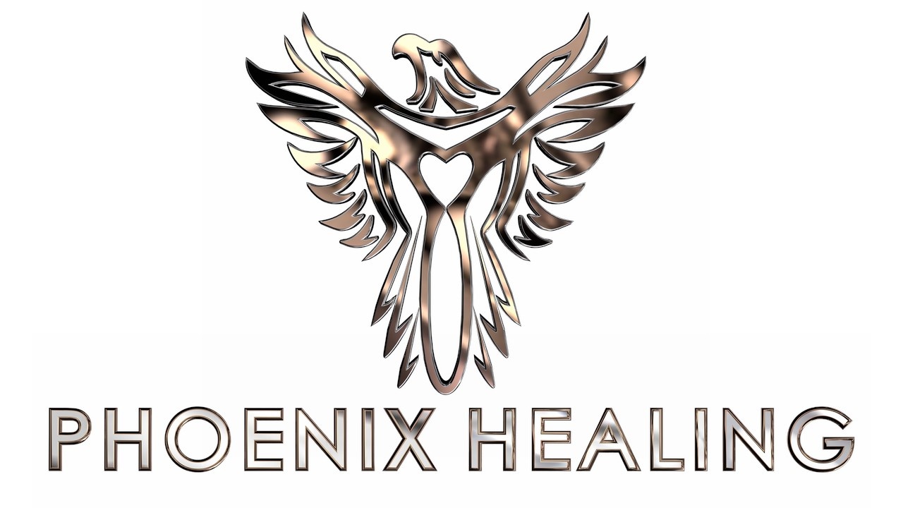
When I tuned in to Jojo I could see a Phoenix in her energy field and I thought that it should be created in a 2.5D format. I also could see her coming up with transformational content to teach people in groups how to overcome the traumas of different types of abuse. So, Phoenix Healing was born and and the name Rise (as in a Phoenix rises from the ashes) was given to the support programme she will be creating.
It takes a lot of work to create such a brand image and it's done in careful collaboration between myself, the client and with Thomas Datt my 3D designer. Designs go back and forth many times as we try to engineer the vision for a client carefully before presenting it to them for comment.
I met Thomas and his wife Alicia back in mid 2019, it truly was the most exciting thing that happened to me that year. Thomas was straight out of the trance music industry and had taken initiations in Reiki. When I read his energy, I could see if he upskilled in a variety of areas, then he could become an incredible audio and visual asset to the Spiritual Industry.
My background when I worked in construction was 3D engineering and I had been looking for 6 years to find someone who might become good enough, to pull off the graphic design power of my inner visions. I used to work on Autocad generating incredibly complex 3D building designs so I know how hard it is to master working with 3D.
Thomas already had good photoshop skills when I met him, but as we started to work together I kept pushing the boundaries on what he was creating for me and the students to get him to keep upskilling until he has become really good at his craft.
I still call him up and explain a design to him and nearly every time, he still is not sure if it's possible to create what we need to for a design, but somehow we always manage to pull it off together.
We have now developed a lasting friendship and business collaboration, to create these incredible designs into reality. Sometimes it takes more than one individual to pull off a cutting edge brand its actually a synergy in this case of visionary, client and designer.
In the beginning I found some images of a Phoenix that started the visual journey with Jojo. Then Thomas and I created a template outline (black and white silhouette digital drawing) and then consulted with Jojo to get the design right. She wanted a heart to the centre of the Phoenix and thus a key outline was born. Once the outline and the shape of the wings head and tail were correctly represented, we shifted the design to be created into a 3D graphic design programme. This image is 2.5D but its still created in 3D to create this effect. Then Champagne Gold Finish was applied in two stages. Lighting is directed at the object in a variety of places and about 7 versions and a bit of Photoshop later you get the finished result of the Phoenix.
Then comes name text for a business and in this case Phoenix Healing. I guided Jojo to the right font style for her brand and we applied a few different finishes to get the right contrast for the Phoenix design.
I also guided Jojo to the right choice of font and design for her name. Which looks absolutely incredible generated in 2.5D;

And I felt like I struck gold when I chanced upon a font that could visually express the name RISE (for her healing group work) against the Phoenix and properly express the feeling of rising from the ashes in your life within the visual expression of the graphic design. This was the end result.....
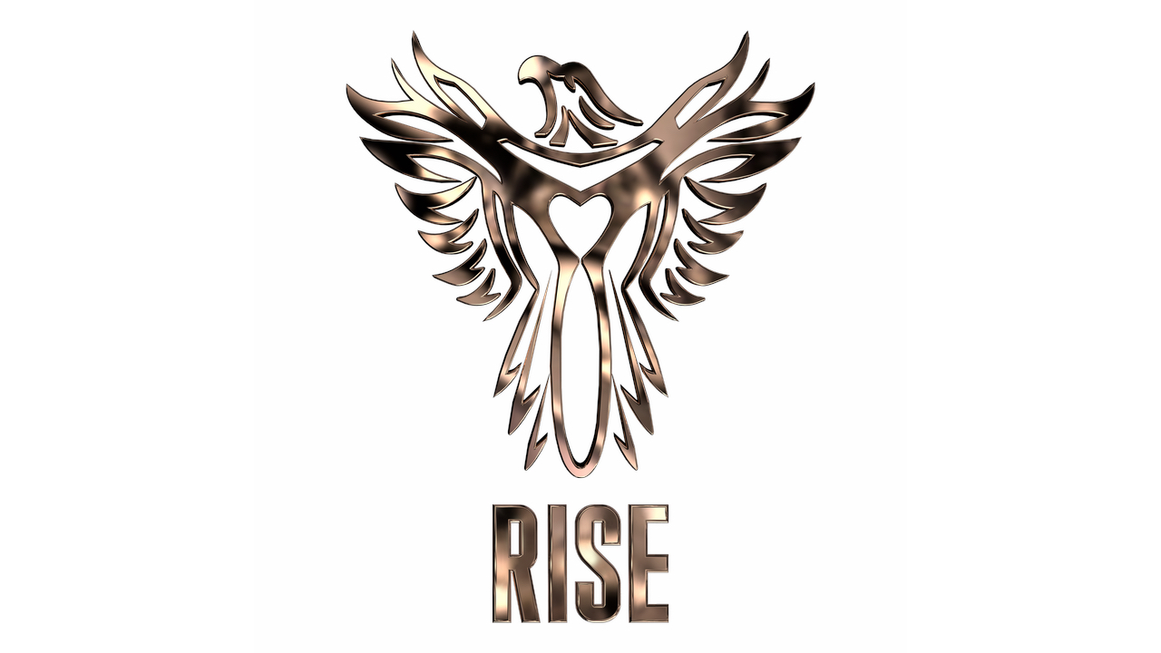
It took multiple revisions to get the words of Rise generated in 3D and changes in lighting etcetera, before Thomas and I could get the right look for Jojo's design.
I have had additional visions ideas of another stage to the design that will sit behind the Phoenix and we hope to be able to continue to create this in time, because it will be a really great way to complement the visual expression of the programme.
Not everything with your brand has to be done all at once, but it is good to get some additional fundamentals created when creating your site and possibly your training programme at the same time. Don't forget to create a TM or an R if you are intending to register your programme, modality or content, you never know if you might need it for your design.
Jojo's site once it is complete will most definitely pass with flying colours the 8 second rule and make people want to look around, just from the visual representation of her brand. It's so incredibly strong its a show stopper !!! literally...
I'm so grateful to be able to tap into the quantum energy field of a student / client and pull down such an incredible energetic design. I'm so grateful that my student Jojo put her total faith and trust in me to deliver to her, this incredible design and I'm so glad that I get to work side by side with Thomas to help my students and clients get the very best cutting edge designs, that really embellish the resonance of who and what energy they represent.
Thanks Jojo for being a top student and allowing me to share my story about your design.
LOUISE WINCHESTER

THE SPIRITUAL BUSINESS MENTOR
AUTHOR
SPIRITUAL BUSINESS LEADER, CLAIRCOGNIZANT CHANNEL AND METAPHYSICS TEACHER WITH OVER 30 YEARS EXPERIENCE.

